

Pikes Beer
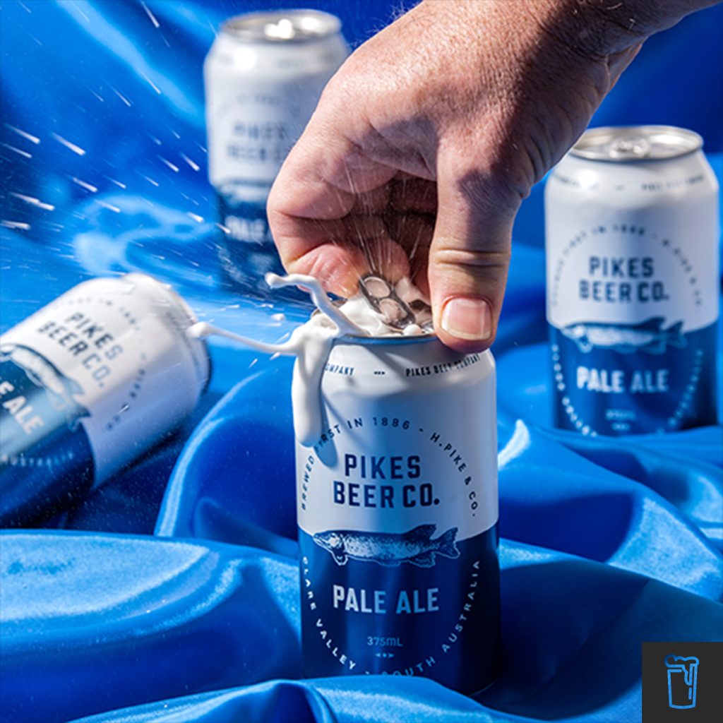
After many years with a strong visual presence and quality craft beer, the time had come for Pikes Beer Co. to change from bottles to cans to meet industry requirements. The Pikes core range needed to be updated and refreshed to reflect these changing times in the industry and to set themselves up for the future, whilst still holding on to their tradition.
Utilising the strong elements of the previous bottled labels, the Pike fish still remained a hero on the can. The introduction of the coloured bold horizontal split became the perfect line for the Pike fish to swim, whilst drawing the consumers eye to the varietal of the beer. Clean and bold type was paired with the classic oval shape design from the past labels. Visually strong, this fish stands out in the sea of craft beers.
Location : North Adelaide, Australia
Project : Pikes Beer Company