


CLIENT
Hunger Station is a bold, Gen Z–centric fast-food brand built on energy, attitude, and cultural relevance. Its identity thrives on emotional intensity, visual dominance, and a fearless communication style — speaking directly to a generation that values authenticity over polish.
ASSIGNMENT
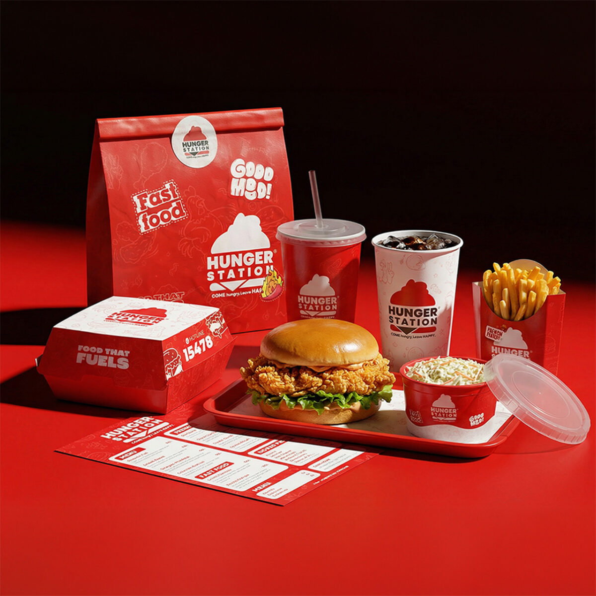
The objective was to develop a cohesive packaging architecture that reflects the pulse of Gen Z culture — expressive, confident, and emotionally charged — while maintaining consistency across multiple formats including burger boxes, buckets, fries packs, dip cups, sandwich boxes, and delivery bags.The challenge was balancing structured scalability with vibrant personality: creating a system that feels alive and culturally fluent, yet commercially strong and instantly recognizable.
SOLUTION & PROCESS
We developed a unified packaging system that merges bold structure with emotional energy — transforming everyday food containers into culturally expressive brand assets.
Cultural Energy as Foundation: Being a Gen Z–driven brand, the packaging couldn’t feel neutral or overly corporate. It had to mirror the audience’s beautifully chaotic confidence — unapologetic, expressive, and full of attitude. The system channels this energy without sacrificing clarity.
The Architecture: A strong horizontal red band acts as the primary structural anchor across all formats. Whether applied to rigid boxes, curved buckets, folded bags, or sleeve-style sandwich packs, this band creates immediate visual alignment and shelf harmony. It establishes order within expressive surfaces and ensures system-wide cohesion.
Logo Structure: The logo is centrally dominant and proportionally scaled for maximum impact. High-contrast white placement reinforces readability while maintaining authority. Its consistent positioning across all formats guarantees instant recognition, even in dynamic or stacked environments.
Color Strategy: Red functions as the emotional engine of the system. Beyond being category-relevant, it operates as a psychological trigger — signaling intensity, cravings, and urgency. White is introduced strategically to create breathing space and elevate contrast, preserving boldness without overwhelming the composition.
Pattern System: A subtle illustrated food pattern wraps around the surfaces, injecting movement and personality. Executed in low-opacity tonal variations, the doodle-style graphics create a sense of spontaneity and cultural fluency while remaining controlled. This “structured chaos” reflects Gen Z expression without disrupting hierarchy.
Material & Texture: The packaging utilizes coated board with a refined matte finish that enhances color richness while maintaining tactile sophistication. The subtle print texture adds depth and surface interest, ensuring the red remains saturated and premium rather than flat or plastic-like.
This systematic yet expressive approach elevates Hunger Station’s packaging beyond functionality — delivering a culturally aligned, emotionally resonant system that feels bold, authentic, and unmistakably Gen Z.
Designer : Peter Said
Location : Egypt
Project : Hunger Station identity & Packaging | Fried Chicken
Client : Hunger Station