

The logo design for The Foodie Bar was conceived as a living system rather than a static mark. From the beginning, the goal was to create an identity that carries energy, movement, and emotion. A logo that doesn’t simply sit on surfaces, but lives through the space, the food, the people, and the moment.
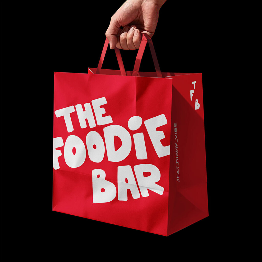
The typography is custom and expressive, built with bold, rounded letterforms that feel almost fluid. The shapes appear playful and slightly imperfect, avoiding strict geometry in favour of controlled looseness. This intentional irregularity reflects the spirit of street food, music, late nights, and shared experiences. The logo does not try to communicate quality through refinement or restraint. It does so through confidence and attitude.
Red plays a central role in the visual language. It is the colour of appetite, intensity, social energy, and nightlife. Paired with white, it forms a clean, high-contrast system that is instantly recognisable and highly adaptable. The palette is deliberately minimal. Nothing extra is needed. The strength of the identity lies in clarity and boldness.
A key design decision was to allow the logo to break apart and reassemble. The words, letters, and the TFB initials can function independently, forming a flexible visual system rather than a fixed composition. This modularity allows the brand to move seamlessly across applications: packaging, bags, cups, wrappers, apparel, tote bags, and everyday objects. The Foodie Bar identity is designed to travel. It doesn’t stay confined to the physical space of the venue.
Scale and placement are used with intention. The logo often appears oversized, cropped, or positioned unexpectedly. It doesn’t decorate the surface. It dominates it. Negative space is treated as an active element, allowing the design to breathe while maintaining strong visual impact. The identity isn’t trying to be polite or discreet. It is direct, bold, and unapologetic.
Equally important is how the logo interacts with materials. Whether printed on paper, fabric, or packaging, it retains its presence and character. Each application reinforces the idea that the brand is part of everyday life, meant to be held, worn, carried, and used.
The tagline Eat. Drink. Vibe. functions as more than a slogan. It acts as a design principle. Every visual choice supports this rhythm: food as pleasure, drink as ritual, vibe as atmosphere. The identity doesn’t explain itself. It invites participation.
The Foodie Bar logo is not designed to be admired from a distance. It is designed to be experienced. A bold, flexible system that captures the energy of the brand and translates it into a visual language that feels immediate, social, and alive.
Designer : A.S. Strategy Branding & Communication
Location : Athens, Greece
Project : The Foodie Bar
Client : The Foodie Bar