

Petal & Stem is a florist founded by two friends, working only with seasonal British blooms and foraged flowers. The brand needed to feel warm, personal, and confident, just like the way they arrange their bouquets.
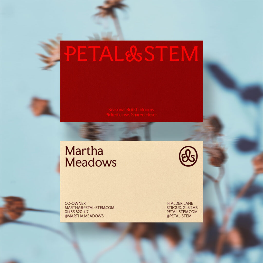
The logo pairs custom typography with an ampersand that gently becomes a flower. This small detail ties the mark to the brand’s activity and gives it a unique, grounded feel that works across all brand applications.
Photography plays a big role in the identity, with natural light, grain, and blur used to give images texture and presence, making the flowers feel real and alive. The illustrations of British wildflowers were designed in the same style, with a soft blur that makes them feel part of the same world. They can be applied across packaging, stationery, and social media, bringing continuity while adding personality.
The color palette combines earthy tones with a few brighter accents. This keeps the brand rooted in nature but gives it moments of energy and joy, reflecting the experience of discovering seasonal blooms. We added a serif typeface to complement the illustrations and photography, giving a subtle sense of elegance without making it fussy.
Every decision (the logo, typography, illustrations, photography, and colors) was made to support a clear strategy. The brand had to work across multiple touchpoints, feel approachable and personal, and reflect friendship, seasonality, and locality. The result is a flexible, cohesive identity that feels alive, consistent, and ready to grow with the florist.
Location : San Sebastián, Spain
Project : Petal & Stem
Client : /