


Domaine Les Danaïdes — English
1. Artistic Vision
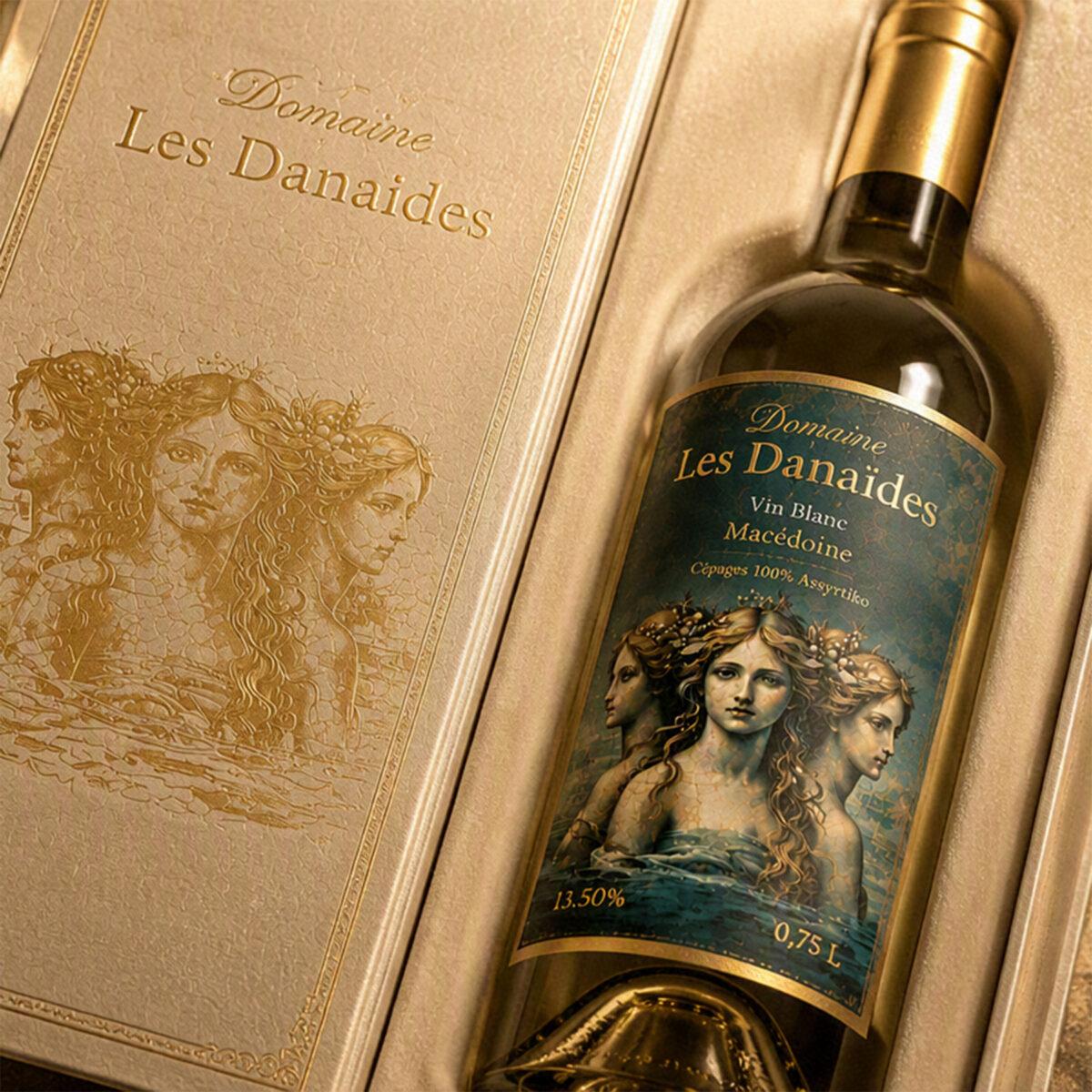
The Domaine Les Danaïdes embraces a rare creative approach: uniting Greek mythology with a contemporary aesthetic while respecting the codes of premium wine design. The visual universe is built on a powerful idea: the eternal gesture of the Danaïdes—condemned to pour water endlessly—becomes a metaphor for white wine flowing, for light reborn, for the cycle of life. This vision gives the project a narrative, almost initiatory dimension, immediately distinguishing the bottle in a competition or professional selection.
2. Visual Composition
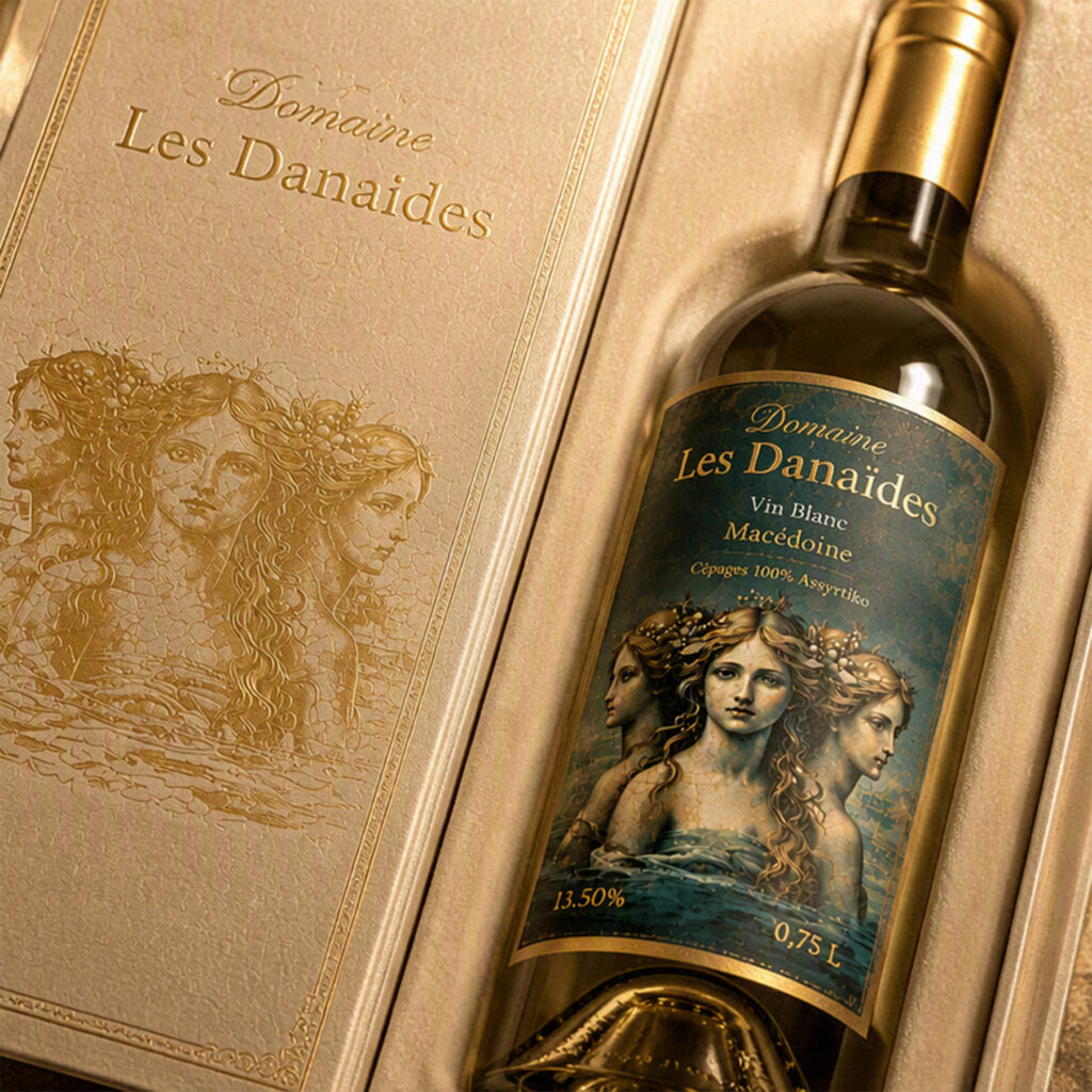
The composition relies on three pillars: the feminine figure, fluidity, and light. The silhouettes of the Danaïdes, inspired by ancient frescoes, are depicted with aquatic grace: translucent drapery, elongated postures, repetitive gestures. The pictorial style evokes Greek mural painting: cracks, patina, mineral pigments. Light plays a central role: golden halos, pearly reflections, contrasts between deep blue and antique gold. This aesthetic creates an iconography that is instantly recognizable—both classical and modern.
3. Chromatic Palette
The palette is crafted as an homage to Macedonia:
Celadon blue and deep blue: the Aegean Sea, the freshness of the Assyrtiko grape.
Aged gold: the Greek sun, the nobility of wine.
Pearly white: purity, light, feminine elegance. This chromatic combination is particularly effective in competitions: it catches the eye, evokes the terroir, and builds a strong visual identity.
4. Typography and Layout
The stylized Greek capital typography reinforces the mythological foundation. The choice of an engraved typeface, inspired by ancient inscriptions, gives the name Les Danaïdes a monumental presence. The layout follows a clear hierarchy:
Domain name at the top, hot-stamped in gold.
Central illustration occupying the space like a fresco.
Technical information at the bottom, in a classic serif typeface (Garamond, elegant serif). This organization respects the standards of wine label competitions while asserting an artistic personality.
5. Materials and Finishes
Textured parchment-like paper, combined with hot foil stamping and selective varnish, creates a premium tactile and visual experience. Judges will notice:
The coherence between material and theme (ancient fresco → parchment texture).
The quality of the finishes (precise gilding, subtle varnish).
The mastery of contrast between matte and glossy elements. These are decisive criteria in wine design competitions.
6. Symbolism and Storytelling
Storytelling is one of the strongest aspects of the project. “Water becoming light.” This phrase encapsulates the aesthetic ambition of the domain: transforming a myth of punishment into a celebration of rebirth, femininity, and purity. For journalists, this narrative dimension offers a powerful editorial angle. For judges, it gives meaning to the graphic composition.
7. Overall Cohesion
The entire project—name, illustration, palette, typography, material, storytelling—forms a complete, coherent, and instantly identifiable artistic identity. This is precisely what judges look for:
a vision,
technical mastery,
a singular aesthetic,
a strong link between the wine and its visual universe.
8. Aesthetic Positioning
Domaine Les Danaïdes positions itself within the category of premium artistic wines, where the label is not merely a support but a narrative artwork. This positioning is rare, distinctive, and perfectly suited to international competitions in label design, packaging, and visual identity.VALERIE COLACE
Designer : Valérie Colace
Location : France
Project : Domaine Les Danaïdes
Client : Domaine Les Danaïdes