


Three services, one visual language, and a little love for print.
This personal project explores a simple idea: what if business cards could do more than just share contact details? What if they could become a small, tangible extension of the services they represent?
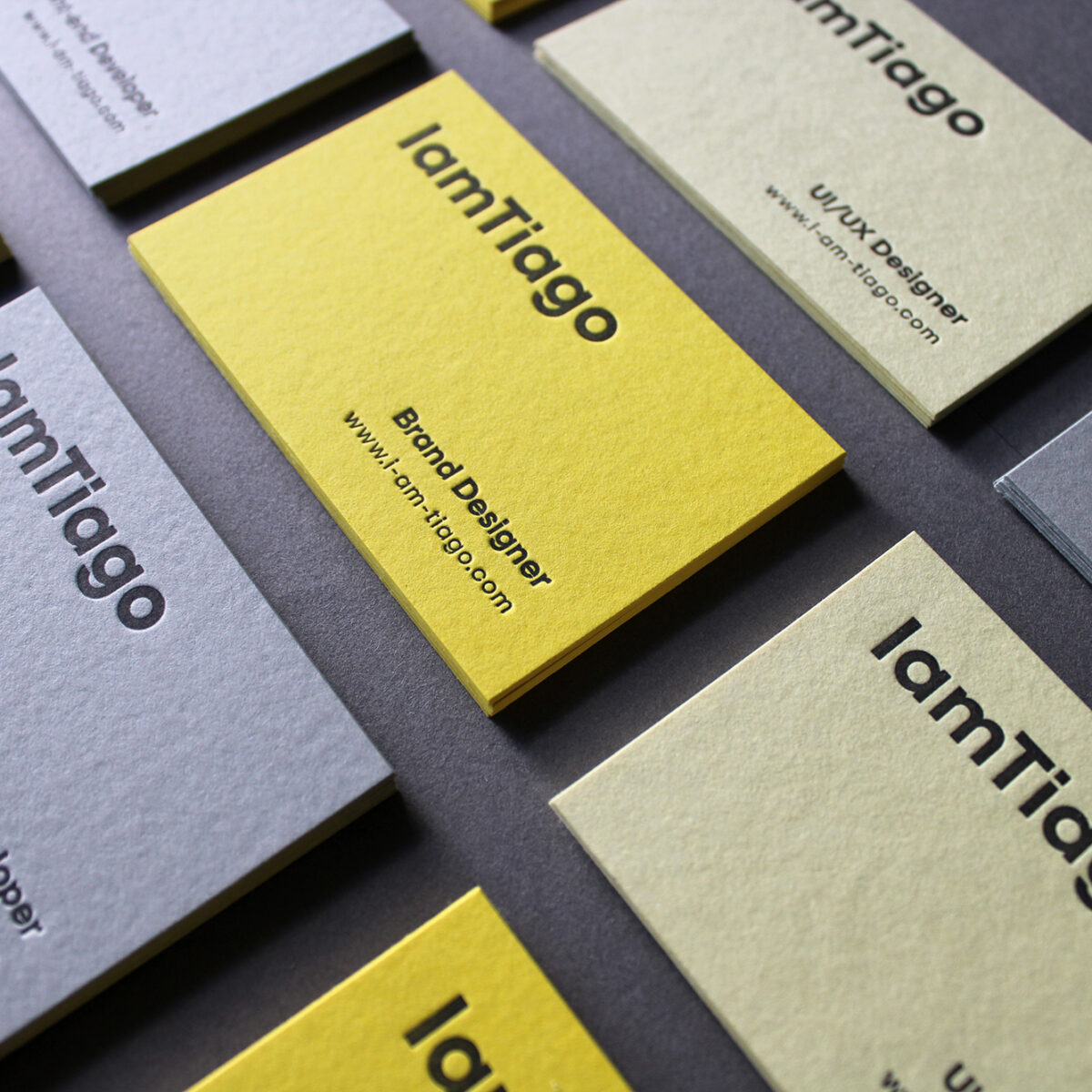
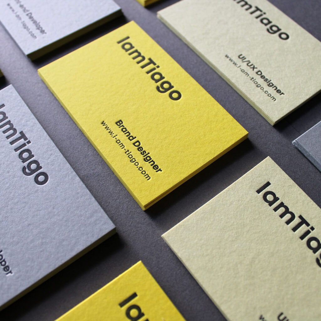
Designed and printed by me using the letterpress technique, the series consists of three business cards with an identical graphic layout, each printed on a different Colorplan paper stock. Real Grey represents Front-end Development, Factory Yellow stands for Brand Design, and Sorbet Yellow identifies UI/UX Design.
Rather than relying on different layouts or graphic variations, the project uses colour and material as a subtle system of differentiation. Each card maintains the same visual identity while its paper stock gives each service I provide a distinct personality.
The tactile quality of letterpress, combined with the carefully selected colours and textures of the paper, brings a digital-first professional practice into the physical world. It’s a small exercise in consistency, materiality, and the idea that even the simplest design decisions can carry meaning.
Designer : Tiago Sá
Location : Lisboa, Portugal
Project : Self-printed business cards
Client : /