
Orchesto was built on a simple insight: retail is fragmented. Brands often work with multiple partners (product, interior design, marketing…) and it’s not always easy to bring everything into one cohesive experience. Orchesto responds to that complexity, working more like a connected orchestra where everything moves in sync.
At Leyma, we approached it as more than a visual identity. We wanted to reflect that idea of orchestration: bringing together disciplines, people, and processes into one whole. The concept of the orchestra became the foundation, balancing structure and creativity, strategy and execution.
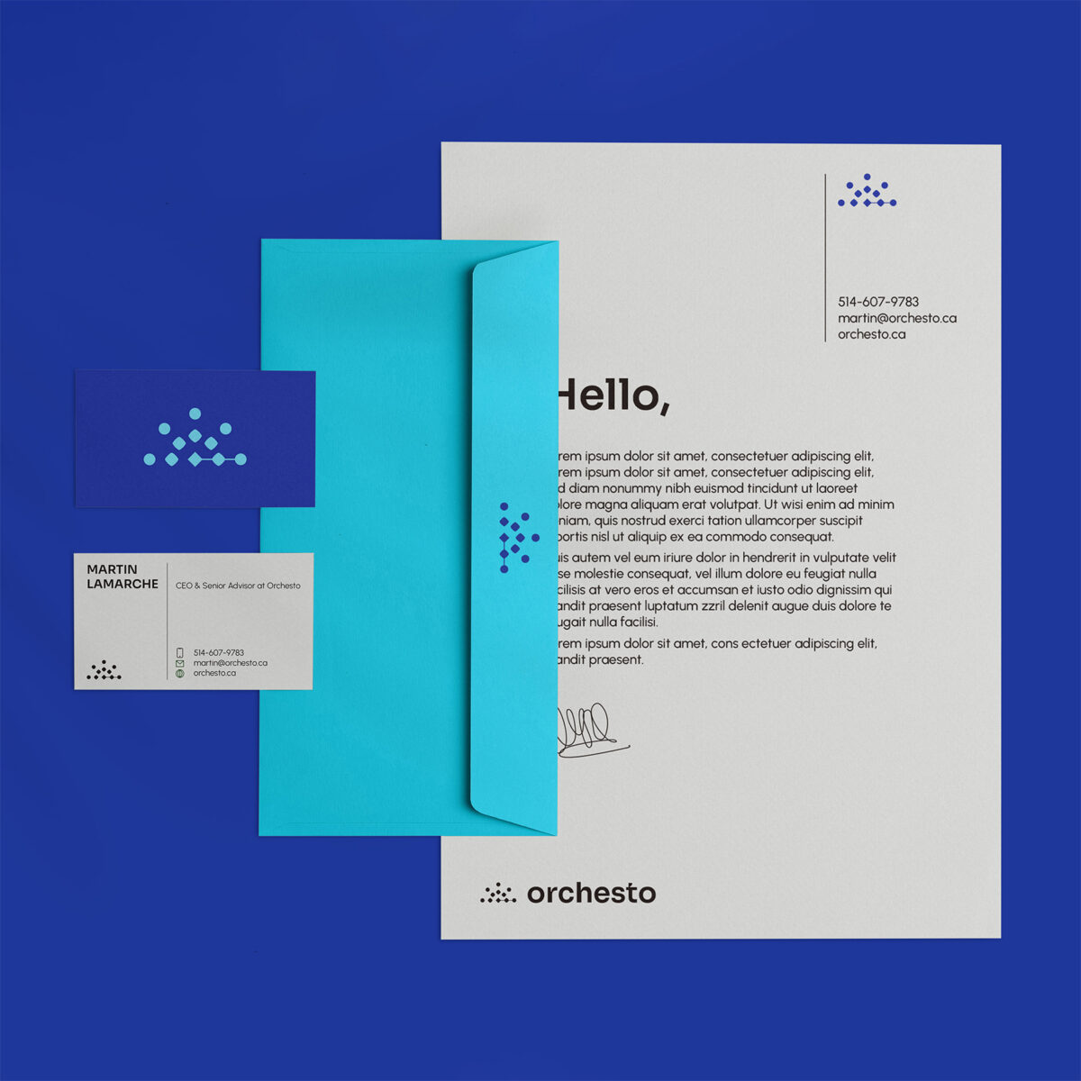
The identity translates this into a system that feels both refined and expressive. The wordmark is built from a custom typographic base, with rounded forms that make it more approachable while keeping a strong presence. Subtle cutouts add lightness and a sense of movement.
The symbol brings this idea together in a simple, versatile way: different shapes represent areas of expertise, connected by a central element that acts like a conductor. A linear detail ties everything together, reflecting the relationships between people, ideas, and execution.
Beyond the logo, the identity expands into a flexible visual language. Shapes become building blocks, and a balanced color system allows the brand to move between more refined or more expressive moments depending on the context. Typography follows the same logic: clear, functional, but with character.
This balance is key. It allows Orchesto to adapt across touchpoints, from presentations to more outward-facing communication, without losing coherence.
More than a visual layer, the identity works as a tool. It helps structure and communicate a complex offer in a clear and consistent way, reflecting what Orchesto is: a way of working where everything comes together.
Location : San Sebastián, Spain
Project : Orchesto Branding
Client : Orchesto