
Branding Concept of the “Be My Nanny” Company
“Be My Nanny” (bemynanny.am) is a modern service for the selection and provision of professional nannies, the visual identity of which we have based on a harmonious combination of trust, care and security. Our goal was to create a branding that would simultaneously reflect both the innocence and warmth of the children’s world, and the feeling of security and high professionalism necessary for parents.
Logo Structure and Idea
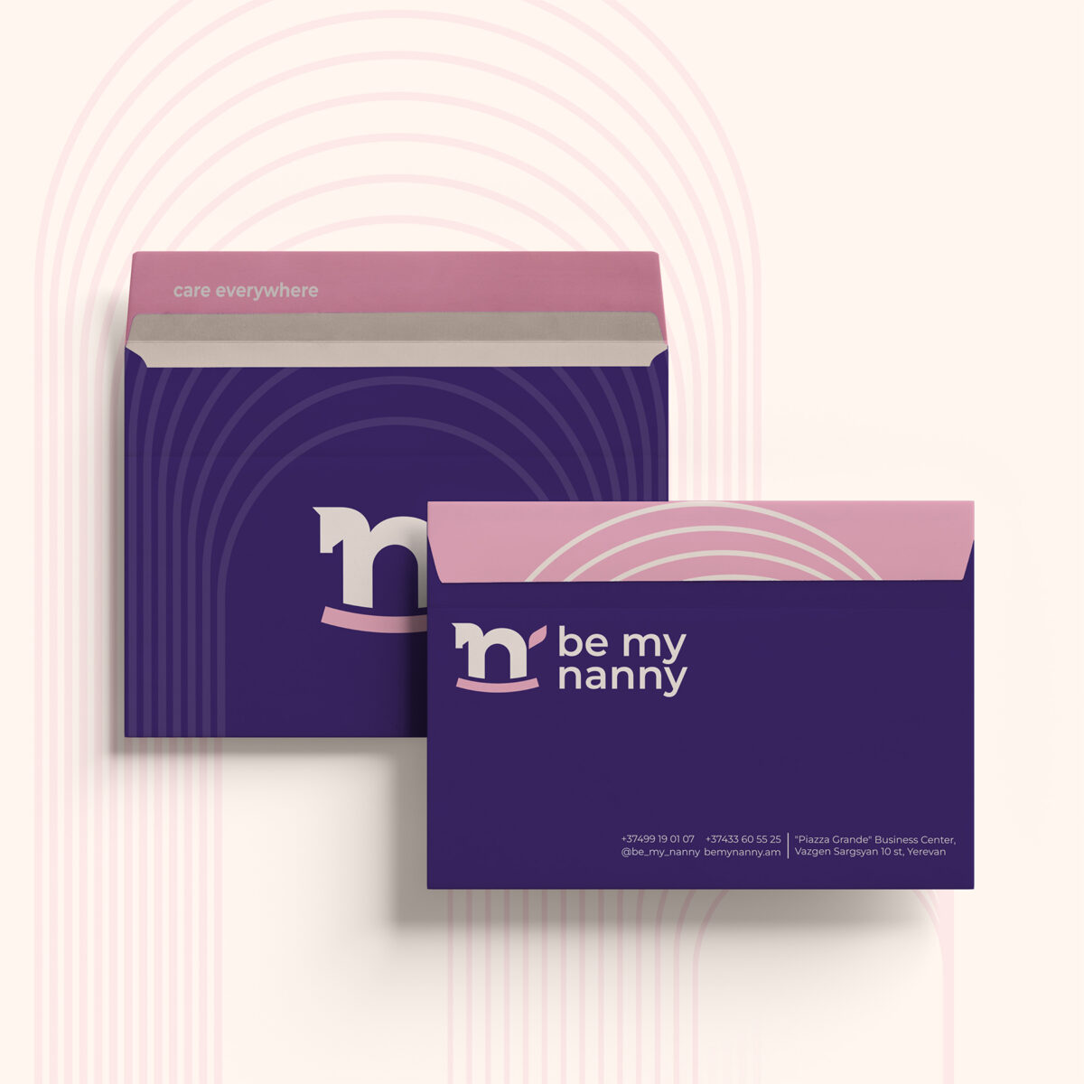
The brand logo is created with a minimalistic, but highly symbolic approach. The main element is the Latin letter “n” (the initial letter of the word nanny), which, thanks to the visual game, has been transformed into the silhouette of a rocking children’s toy, a rocking horse. The lower pink curved line simultaneously symbolizes both the solid support of the toy and a sincere human smile. The small detail at the top (the toy’s ear) adds dynamics, life and a playful mood to the image. This design solution is easy to remember, friendly and immediately associated with childcare, while maintaining corporate literacy.
Color Palette
The choice of colors was made with a special psychological meaning:
Deep Purple: Selected as the main background and text color. It is associated with wisdom, calm, premium quality and stability. It conveys a message of reliability and professional attitude to parents.
Soft Pink & Cream: As complementary contrasting colors, these symbolize tenderness, childish carefreeness, empathy and maternal warmth.
The combination of these two poles – assertive purple and delicate pink – creates a reliable, but very accessible and friendly image.
Typography and Graphic Elements
The font is rounded, without sharp corners (Rounded Sans-Serif), which is subconsciously associated with safety, softness and direct contact.
As additional corporate elements, four-pointed stars (sparkles) were used, which emphasize the “magical” approach to each child and the excellent quality of service. Also used are graphic thin, concentric semicircular lines, reminiscent of a protective aura or ever-expanding waves of care.
Brand Application
The entire branding is designed with the principle of high flexibility. It is ideally adapted both in the digital domain (website interface, mobile application notification design, social media publications), and on physical media. The brand style is particularly impressively displayed on the staff uniforms (purple polo shirts with pink sleeves), as well as in the modern, minimalist business card design, creating a unified corporate culture.
Overall, the design we created successfully solves the visual communication problem set before it, positioning “Be My Nanny” in the market as a modern, caring, absolutely safe and premium service.
Designer : Atyan Design
Location : Yerevan, Armenia
Project : Rebranding for Be My Nanny
Client : Be My Nanny