
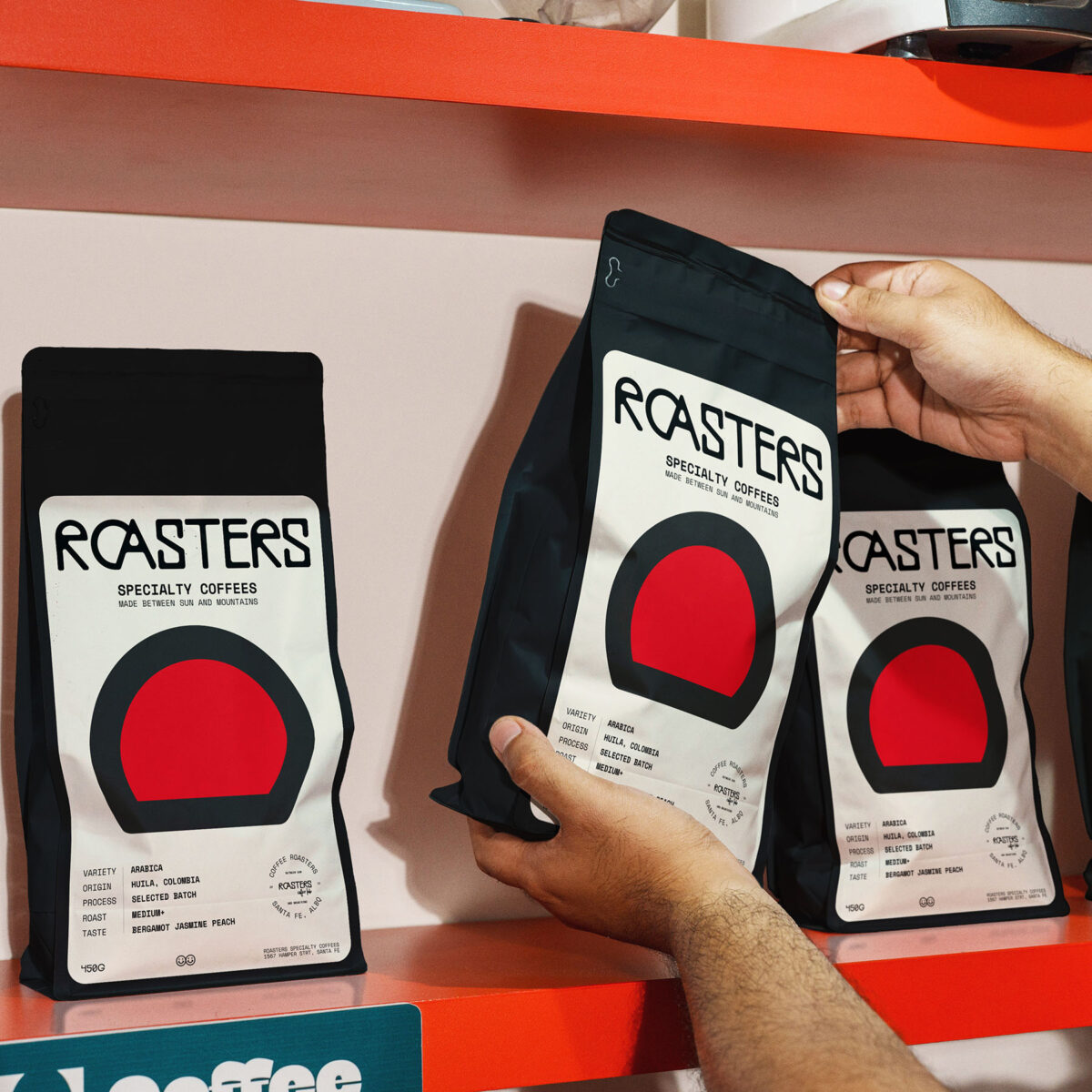
Designing coffee packaging requires conveying origin, quality, and character at first glance while standing out on shelf. For ROASTERS, the approach was to translate sourcing and terroir into a clear and authentic visual language. The brand’s focus on limited micro-lots, organic beans, and precise roasting shaped the conceptual foundation, inspiring an identity rooted in landscape and craft. The visual system combines minimalism with strong expression: a bold typographic logo structures the composition, while a warm yellow and deep red palette evokes sun, heat, and earth, creating immediate impact and coherence across the range. A subtle typographic detail, the O sliding behind the A, introduces a narrative dimension, echoing a sun setting behind mountains. The result is a scalable and distinctive packaging system that balances clarity and premium positioning, capturing the essence of coffee shaped by its environment.
Designer : ALAMANO STUDIO
Location : La Rochelle, FRANCE
Project : Roaster, specialty coffees
Client : /