
Crepaland is a food service franchise established in 1992, with a strong presence across Greece and Cyprus. The rebranding was driven by a strategic shift towards a takeaway-first model.
The objective was not simply to redesign the identity, but to reposition Crepaland within a more contemporary, fast-paced market, creating a cohesive system that communicates freshness, speed, and consistency across every customer interaction.
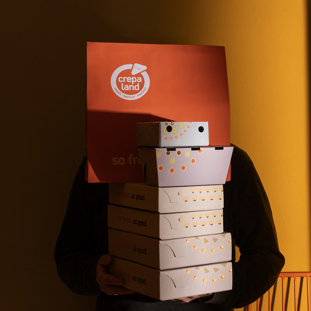
At the core of the new identity lies a refined logotype, carefully evolved to maintain recognisability while improving clarity, balance, and adaptability. From this foundation, a structured visual language was developed, based on geometric elements derived from the logo itself.
These elements form a precise grid system that defines layout, proportions, and composition, supporting a series of custom illustrations inspired directly by the products. The illustration style is simple, bold, and immediate, creating a clear connection between the brand and its offering, while allowing flexibility across applications.
The result is a scalable and highly functional design system that responds to the everyday needs of a takeaway brand. A colour-coded structure enables clear differentiation across product categories, while maintaining overall coherence.
The visual language extends seamlessly across packaging, menus, digital environments, and in-store applications, ensuring consistency at every touchpoint.
More than a visual refresh, the project establishes a strong and recognisable presence, aligning Crepaland with the expectations of a modern audience while reinforcing its long-standing position in the market.
Designer : AERAKI.DESIGN
Location : Athens, Greece
Project : Crepaland
Client : Crepaland