

Tella Thera is a five-star boutique eco-hotel in Crete, designed for conscious travellers seeking slow living, sustainability and understated luxury. With a deep respect for the land and local culture, the hotel approaches hospitality in an organic way, where architecture, materials, food and rituals are inseparable from place and time, carefully curated to reconnect guests with nature, quality time, and themselves.
The corporate identity designed for Tella Thera translates this philosophy into a cohesive visual language rooted in simplicity, respect for the environment and the soil. At its core lies the name itself. Tella derives from Tellus, associated with the earth and fertility, while Thera connects to the Greek concepts of summer (theros) and harvest. Together, the name reflects a reciprocal relationship between humans and land: caring for the earth so it can care for us in return. This idea becomes the foundation of the entire identity system.
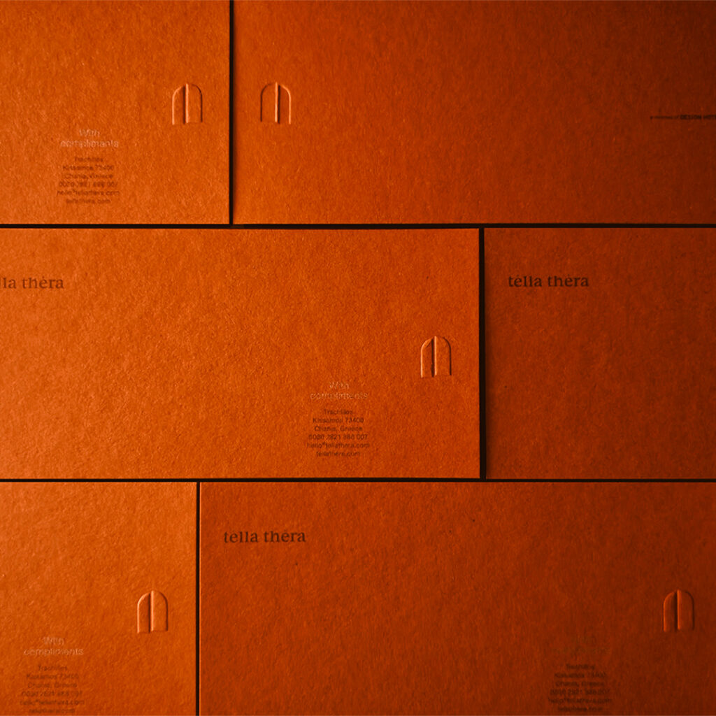
The logo is spartan. Its typography is calm and grounded, avoiding decorative gestures in favour of balance and clarity. Rather than competing with the surrounding environment, it allows space for materials, textures and experiences to speak. The symbol is a half open gate and is designed with scalability at its core, allowing it to function consistently across a wide range of applications and formats. It complements the logotype with a simple, organic form that evokes continuity, grounding and shelter.
Secondary graphic elements play a key narrative role. A custom set of pictograms, inspired by Mycenaean ideograms—the earliest attested form of the Greek language— translates services and amenities into simple, intuitive signs. These are paired with minimal illustrations inspired by Minoan art’s deep connection to nature, referencing birds, plants and waves. Reduced to essential lines, they create a contemporary visual rhythm while subtly expressing the respect and harmony ancient generations cultivated with the natural world.
Materiality is central to the system. The identity is designed to live on natural substrates—paper, clay, fabric—where texture and imperfection are not flaws but features. This philosophy is most clearly expressed in the custom olive oil bottle created as a guest gift. Conceived as a designed object rather than a souvenir, the bottle is made of clay and shaped after the olive fruit itself. Soft, rounded and irregular, it carries the imprint of human touch through a deliberate dent in its surface. Finished in white, it allows form and material to lead, inviting everyday use rather than display.
Across signage, stationery, packaging and guest experiences, the identity remains consistent yet flexible. It does not aim to impress through excess, but to build a quiet sense of coherence. Tella Thera’s visual language ultimately functions as an extension of its hospitality: calm, thoughtful and deeply connected to place, where design becomes a medium for memory, ritual and lived experience.
Designer : A.S. Strategy Branding & Communication
Location : Athens, Greece
Project : Tella Thera Identity
Client : Tella Thera