


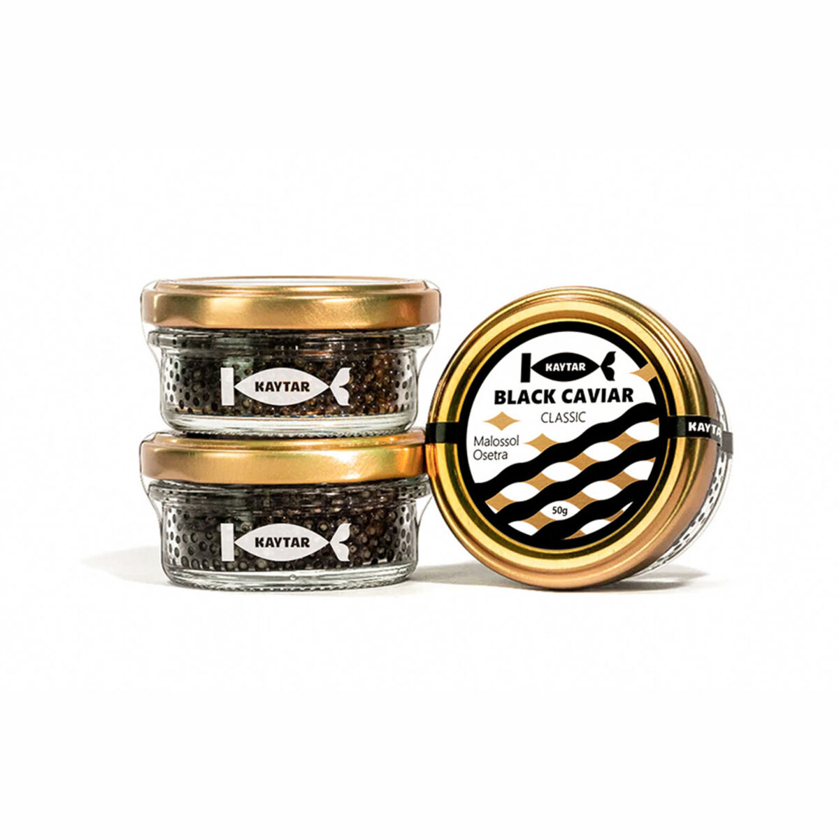

As a result of the cooperation between MAROG and KAYTAR, a fresh and vibrant brand was crafted featuring a dynamic and lively name, a striking visual identity, a unique verbal tone, and a thoughtfully developed value system. Since kaytar is most commonly related to the character of fish, we chose it as the brand name, reflecting its strong connection to the vibrant nature of fish. The KAYTAR logo consists of a symbol and a wordmark. The symbol incorporates the letter “K” from the wordmark, with protruding parts of it stylized to mimic a fish tail. The black and white palette gives it a clean, timeless look, while gold adds a premium touch. Secondary colors—red, green, and blue—reflect marine diversity. The graphic elements, inspired by fish scales and water patterns, bring the brand’s aquatic theme to life.
Designer : MAROG Branding and Marketing Communications
Location : Yerevan, Armenia
Project : KAYTAR Fish Products Branding
Client : KAYTAR