

The brand name “Summertime safeness” is a pun on a Lana Del Rey song. The slogan is also an altered line from the song.
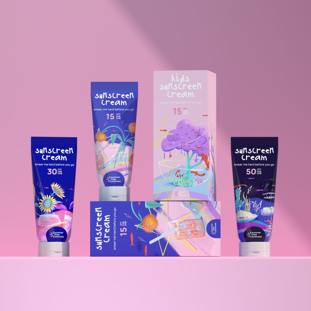
The brand produces a line of sunscreens with a natural and effective composition of varying degrees of protection.
The idea of the logo is a combination of images of a beach umbrella and the sun. 4 different illustrations were created for the packaging design. The metaphor is that the sun “bites”, as do various sea creatures. The higher the degree of protection of the cream, the darker the illustration and the more dangerous the creature depicted on it.
Designer : Tanya Sasonko (designer) & Mari Telcova (illustrator)
Location : Saint-Petersburg, Russia
Project : Summertime safeness (logo and packaging of sunscreen cream)