

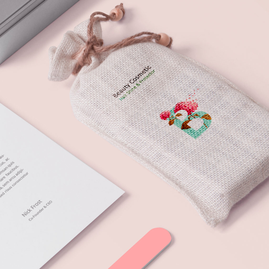
I tried to use a colorful pattern to reference the purity which is available in nature, the natural colors which are not dangerous or do not remind us of chemical products.
I tried to use a collection of simplicity in font, shape, and adjacent of pure color which broaden the safety sense of consumers.. it is worth mentioning that these colors represent their activity and potential.
The beauty cosmetic STATIONARY is trying to absorb a new range of consumers who are always concerned about their beauty staff in terms of whether they are organic, healthy, pure and so on
Location : Tehran, Iran
Project : Beauty Cosmetic Stationary & Logo design