

BOLS is the oldest distilled brand in the world and a real “Amsterdam brand”. The Bols family started distillery ‘t Lootsje at the end of the 16th century. Amsterdam’s guts and entrepreneurial spirit go hand in hand through the history of the family brand. Amsterdam owes its success to a familial, tolerant way of doing business. Similarly for Lucas Bols.
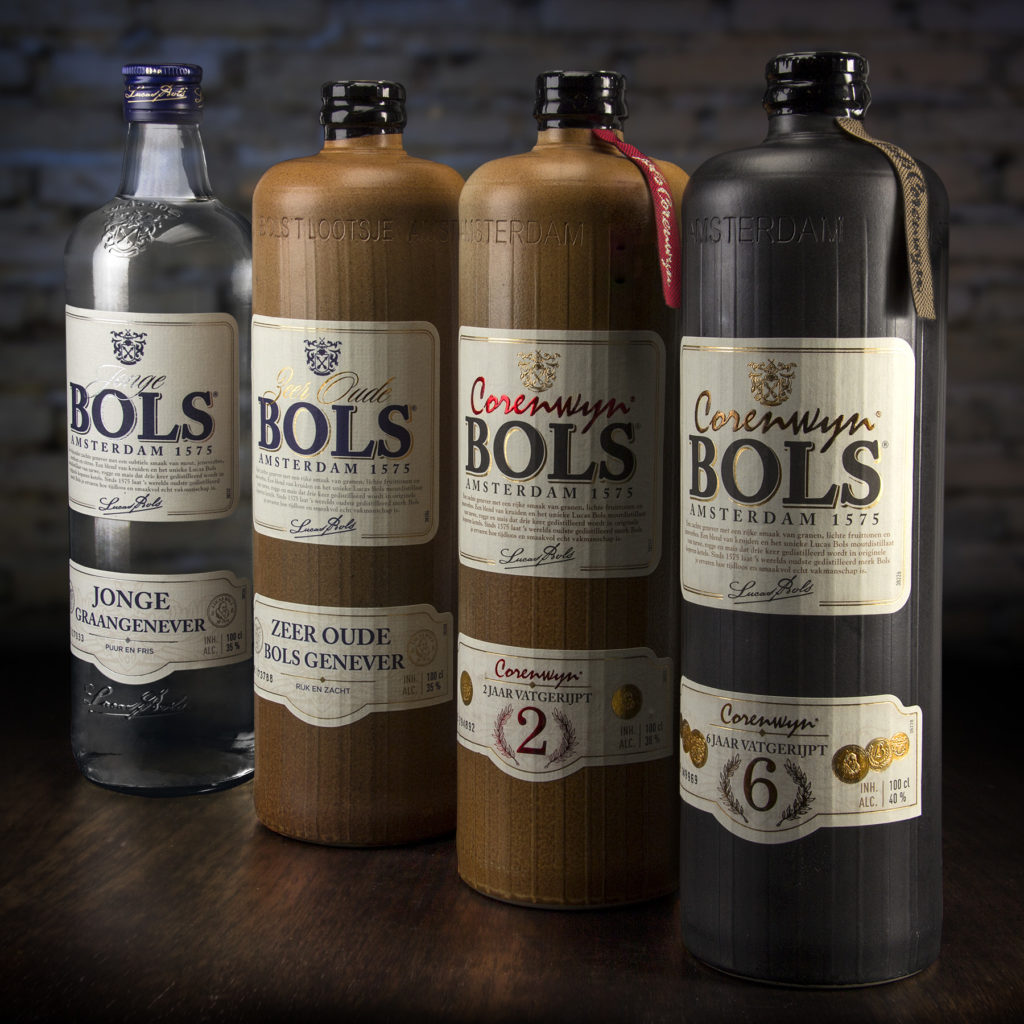
So, you can say there was a lot of historical information to work with, when we were asked to redesign the entire authentic Bols Genever range (an iconic Dutch Spirit, called “Dutch Gin” outside of Holland) which consists out of the variants; young genever, very old genever, corenwyn 2 and corenwyn 6. One bottle and three jars that are even more radiating to be part of one Bols family now. With references to the heritage and Amsterdam the design stands for craftsmanship, taste, top quality and Amsterdam guts.
Design notes;
– In order to remain faithful to the impressive Bols History, the authentic genever bottle and stone jars have been used. Fun, but important, fact is that our new generations like the authentic “old stuff”, and that bars/clubs are even pouring genever back into old stone jars to serve it and give the complete experience.
– For all 3 stone jars, however, a specific production method has been chosen, trough which rough tracks are visible on the jars (also visible through the labels). This gives an authentic robust look&feel and extra grip, while pouring.
– Introducing an identical design layout for the complete range, to visually create 1 strong family.
– Introduction of a new classical restyled Bols logo, with a strong link to the origin; Amsterdam 1575.
– There are flavor notes and historical info on the main label (top label).
– The lower label shows the kind of spirit, high quality, origin and craftsmanship.
– The two luxury corenwyn variants are distinguishing themselves by a second colour hot-foil, embossing on the labels and the well-known corenwyn opening ribbon.
– For the complete range of 4, there are small differences in nuance between each individual variant to indicate a clear order of quality and depth. Things like; glass or jar, colour of the jar, use of silver foil or gold foil, introduction 2nd foil and embossing, open or closed coin design, blue or black Bols logo, blue or gold crest,…. are all extra characteristics helping to establish a clear order in quality.
History brought back to life through packaging design
Designer : Van Heertum Design VHD
Locality : Tilburg, Netherlands
Project : Bols Genever Packaging Range