


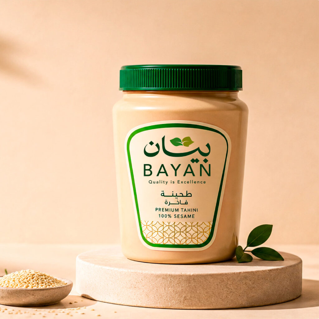
BAYAN is a Sudanese food manufacturing brand specializing in biscuits, tahina, and halawa products. The brand was created to deliver high-quality food products that combine authentic taste, reliable quality, and accessible value for everyday consumers.
The challenge was to create a visual identity that could bring together different food products under one recognizable and cohesive brand, while communicating quality and trust without losing the authentic character of the brand. BAYAN needed a visual language that could feel modern and distinctive while remaining approachable and relevant to its Sudanese market.
The identity was built around four core values: quality, trust, nature, and sustainability. These values became the foundation for a simple and memorable visual system designed to communicate the natural and reliable character of the brand.
At the center of the identity is a distinctive Arabic typographic logo for “بيان”, supported by a botanical symbol formed from two organically shaped leaves that subtly create the letter “B”, referencing the first letter of BAYAN. The leaves represent nature and sustainability, while the space between them suggests the beginning of a growing seed, symbolizing growth, development, and the continuous evolution of the brand.
The visual identity extends this concept through a natural color palette, botanical elements, typography, and a flexible graphic system. The combination of deep greens, warm cream tones, and organic forms creates a visual language that feels natural, trustworthy, and contemporary.
The packaging system was designed to bring consistency across BAYAN’s different product categories, including biscuits, tahina, and halawa. Each package maintains the core elements of the identity while allowing enough flexibility to distinguish between products and create a clear, recognizable product range.
The system was developed to work consistently across packaging, social media, printed materials, promotional applications, and other brand touchpoints, creating a unified presence throughout the customer experience.
BAYAN is ultimately built around a simple idea: quality that people can trust, presented through a brand that feels natural, authentic, and easy to remember. The identity translates this idea into a visual system that balances quality, trust, nature, sustainability, and contemporary simplicity.
Designer : Sami Asaad
Location : Qena, Egypt
Project : Bayan Food Brand Identity and Packaging Design
Client : Bayan