

When in Denmark, Gorm’s is a great place to eat. The cosy atmosphere and excellent Italian cooking with a Danish twist make the recipe for a great night. As the restaurants filled, the popularity grew, and Gorm’s expanded. In 2021, the founders bought back the owner majority of the company from Norwegian Orkla.
So Gorm’s teamed up with Scandinavian consumer brand agency Everland to develop a new brand position and design. The ambition was to future-proof the company and create synergy across all business units, having them tell the same story of homemade food in cosy settings.
Gorm’s became nationally known for crispy, thin Neapolitan pizzas. However, their menu card covers much more. It’s a Danish restaurant with an Italian twist. This thinking penetrates all concepts, whether their restaurants, pizza bars, pop-ups or ready-to-cook products. Everland helped define a strategic platform and a flexible design that works across all their business units. The brand foundation strengthens the business now and acts as a facilitator of future initiatives to expand the Gorm’s brand.
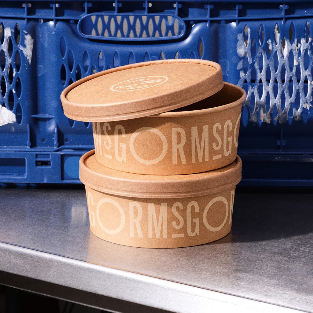
Visually, Everland drew inspiration from Italy. All these inputs were interpreted in a Scandinavian context, giving the design contrast and an edge.
“We balanced the Nordic with the Italian and vice versa,” explains Jonathan Faust, Design Director at Everland. “One example is the typography inspired by classic Italian lettering but placed on large, bare surfaces. At the same time, we used dynamic and warm colours that we combined for a clash that makes the brand design look interesting and builds character.”
Gorm’s new visual identity is gradually rolled out across restaurants, website, social media and other touchpoints.
Designer : Everland
Location : Copenhagen, Denmark
Project : Italy Interpreted