

In Old French, Amore is used to define love… And love usually mostly refers to a deep feeling of tenderness and empathy towards a person. However it includes a wide range of different feelings ranging from romantic love, family love etc…
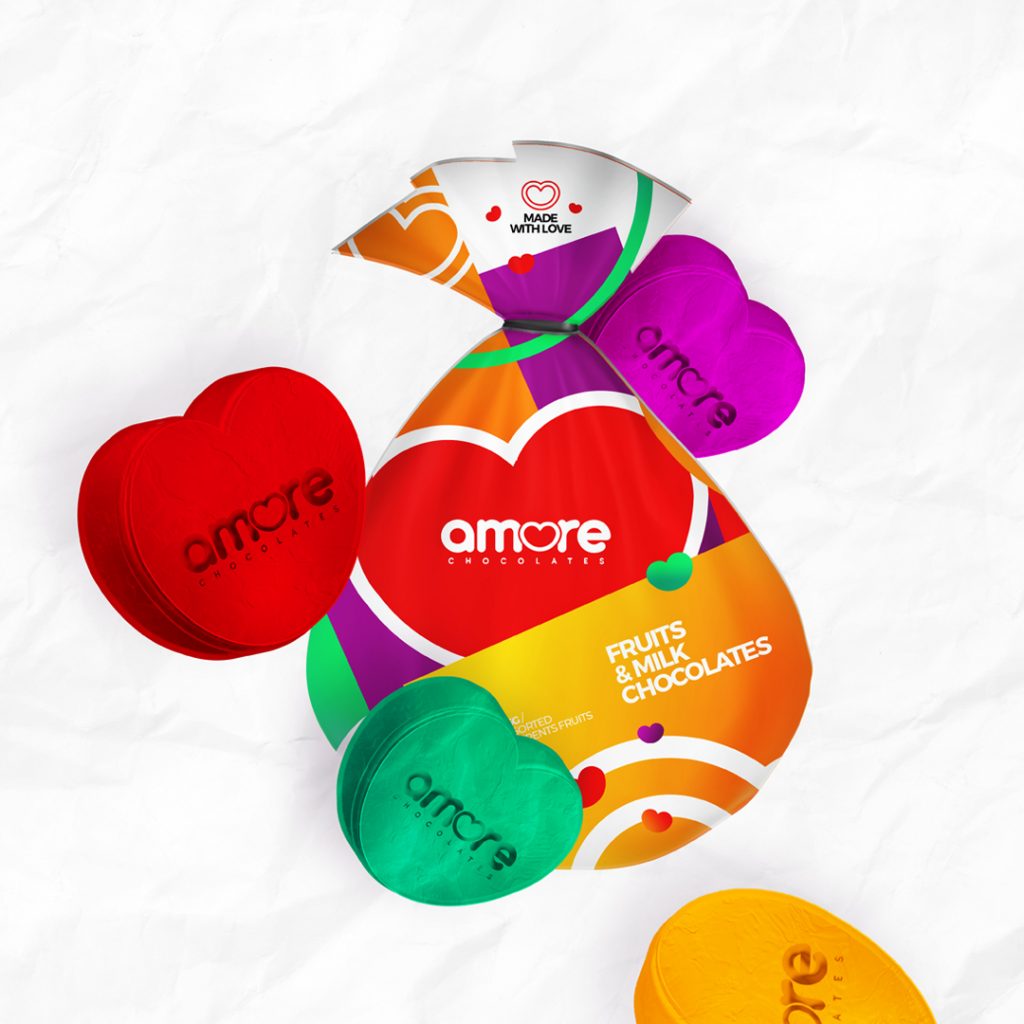
The brand transcribe this with the symbol of the heart (symbol of love) which replaces the letter O in Amore (structure of the logo). The heart symbol vector has a rounded bottom instead of a tapered bottom. The idea
is like the arms of a comforting person, yearning for peace, for joy. The rounded and simple typography in itself makes the brand consistent and reflects its values…
The choice of the shape of the packaging is not the result of chance… The rounded shape of the bottom echoes the symbol of the logo (illustrated heart) for an apprehension and recognition of the brand. The design of the packaging with rectangular shapes puts us in line with the chocolate industry because of the square and rectangular shapes that we all love, our favorite chocolate bars!
The branding works with bright, fluid and joyful colors specially chosen to inscribe the brand in a friendly, joyful spirit. The whole forms an expressive packaging, bringing emotions and which is above all in correlation with the values of the brand
Designer : KOMLAN Koami Junior Natèba
Location : Lomé, Togo
Project : AMORE CHOCOLATES