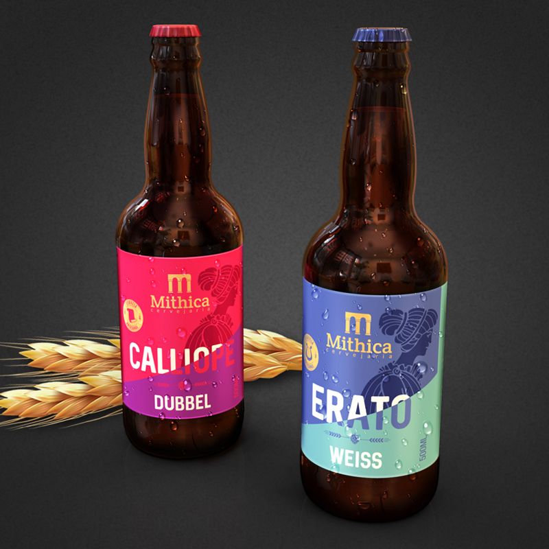
The product, developed with the best ingredients, needed a package that communicated the essence of the drink and the brand.
Inspired by the Greek muses, a label was developed for each of the four variations of the product, designated with the names of four characters in mythology.
The label has a modern look, created both by the diagonal that captures attention to the name of the product and divides it into two saturated colors, as well as by the typography used.
The Mithica brand stands out at the top of the label, in gold, as well as the seal bearing the icon representing each muse. Also worthy of note is the illustration of the female figure representing all four Greek muses, in the style of illustrations from ancient Greek vessels.
Finally, the formatting of the information on the label was done in such a way that its reading became intuitive and fast. Thus, with the various elements used in the packaging, a language was constructed that highlights the product and attributes added value to the brand.

