

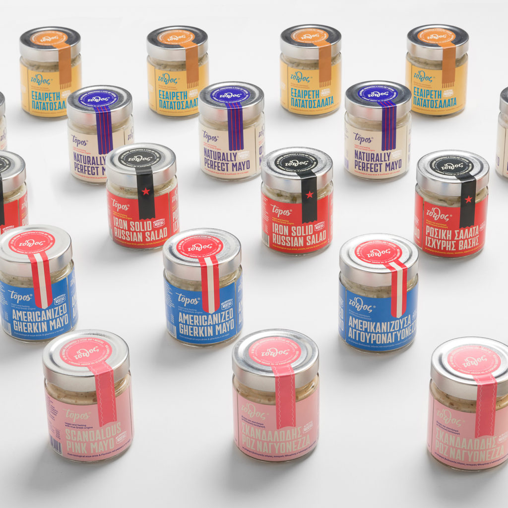
“Topos” line of products, consists of 5 different flavours produced with the same natural and tasteful base – biological soya drink. Made out of pure ingredients, 100% vegan condiments. The intense colour palette, the all capital lettering of the titles with references to newspaper headlines of the 20’s and 30’s, and the purposefulness of each flavour’s given name, create a memorable and unique image to the customers’ eyes. “Topos” in stands for “birthplace of origin” in everyday speech and the logo incorporates the brand’s roots, by utilising the characteristic font by Stella Project (a digitised version of cinema and pop lettering in Greece during the 50’s & 60’s – fonts.gr) on the wordmark. With an uplifting mood, a vivid palette, descriptive yet purposeful and funny titles, “Topos” line of products is placed gracefully and with a slight smirk, both in the domestic (Greek) and international markets, winking to the customers. These titles are as sarcastic as informative – for they convey the origins, inspiration or a hint in usage of each flavour.
Designer : Phantom Design House
Locality : Thessaloniki, Greece
Project : Topos vegan condiments